Those that follow my personal account onTwitterwill be familiar with my weekly S&P 500 #ChartStorm in which I pick out 10 charts on the S&P 500 to tweet. Typically I’ll pick a couple of themes and hammer them home with the charts, but sometimes it’s just a selection of charts that will add to your perspective and help inform your own view – whether its bearish, bullish, or something else!
The purpose of this note is to add some extra context beyond the 140 characters of Twitter. It’s worth noting that the aim of the #ChartStorm isn’t necessarily to arrive at a certain view but to highlight charts and themes worth paying attention to.
So here’s the another S&P 500 #ChartStorm write-up!
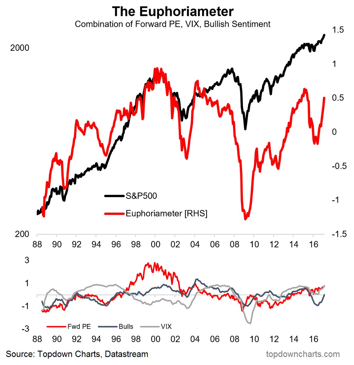
1. The Euphoriameter: TheEuphoriameteris a composite sentiment indicator that combines forward PE ratio, the VIX, and bullish sentiment from the investors surveys to provide a view of whether sentiment is becoming frothy or fearful. The indicator signaled the bottom during the 2015/16 troubles and the top just prior. At this point it is becoming more and more euphoric with all 3 components rising. Such a surge is something to pay attention to. But before you go putting your contrarian bear hat on, just notice the way it also surged after the 2003 market bottom.
Bottom line: Euphoria is rising.
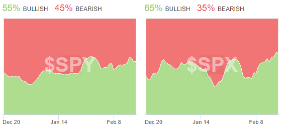
2. StockTwits investor sentiment: The real time measure of investor sentiment on StockTwits is showing investors increasingly bullish on the S&P500 and the main S&P500 ETF. But what I noted on Twitter is that the bullish % is 55% and 65%… bulls are in the majority, but not an overwhelming majority at this point. So you could say it represents strong momentum. What it does say is that investors are no longer primarily bearish.
Bottom line: StockTwits investor sentiment is becoming more bullish on the S&P500.
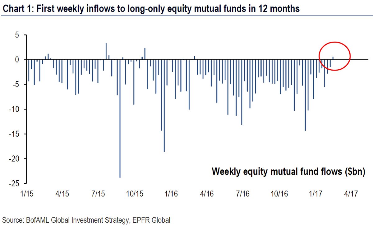
3. Mutual fund flows: The chart hereshowsweekly net flows to long-only equity mutual funds, and remarkably – shows the first positive net flow in 12 months. It’s very interesting to reflect on the waves of outflows here given how well the market has performed over that time. Just goes to illustrate the well known point that retail flow often chases performance, and for the most part allocates sub-optimally. A good reminder to beware of your own psyche!
Bottom line: Mutual fund flows have turned positive after 12 months of outflows.
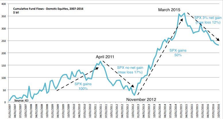
4. Don’t forget the flow: Following on from the previous graph the next table shows cumulative fund flows with market performance annotated byUrban Carmel. Adding to the point above of how flows can be reactionary and performance chasing, they can also become very quickly self-reinforcing. So it is thus notable that we’re starting to see flows tentatively come back – could be an important fuel for the market.
Bottom line: Flows can have a self-reinforcing effect on the market.
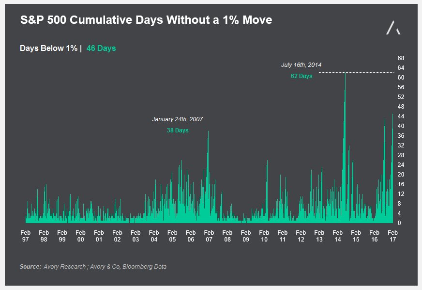
5. Where did the 1% go? Forget about the top 1%, what about the1% daily price change- the market has gone into a fascinating state of steadiness, where volatility has contracted, has the market all of a sudden become more rational, less erratic, and more efficient?
Bottom line: It has been 51 days without a 1% move.
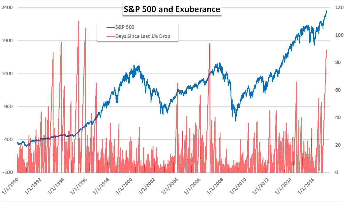
6. The 1% again! This time it’s the 1%… drops. It has been 89 days since a drop exceeding 1%. It’s quite a remarkable statistic and speaks to the great moderation in volatility. Trouble with thechartis that when you overlay it against the S&P500, it goes from fascinating statistic to somewhat of a herring of the red kind. There’s not really any meaningful signal in it. Sometimes it flags a short-ter market top. But other than that, it’s still very interesting…
Bottom line: It has been 89 days since a daily fall in the market of 1% or more.
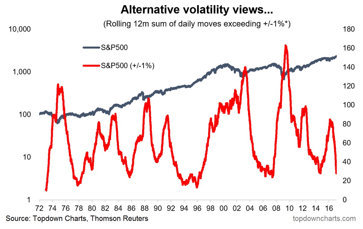
7. More about the 1%! If you liked the previous two graphs you’ll love this one. It shows the collapse in rolling 12 month count of days where the price change exceeded 1% +/-. Thisalternative view of volatilityhas some merit in determining the market regime. When the indicator spikes it often signals a market bottom, and when it falls after spiking it often signals the start of a new bull market…
Bottom line: This alternative view of volatility shows a collapse in volatility.
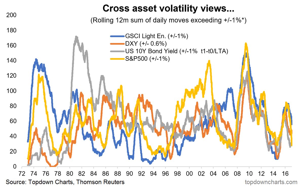
8. Everywhere 1%! Taking the previous chart and rolling it out to other asset classes you get the below cross-asset view of volatility. The chart comes from the latest edition of theWeekly Macro Themesand gives a multi-asset perspective on volatility. Incredibly the chart shows that after years of relatively independent movement in volatility across asset classes, ever since the 2008 crisis we’ve seen a remarkable co-movement of volatility… When volatility rises in one asset class it likewise rises across most other simultaneously. This is perhaps another nail in the coffin of static set and forget strategic asset allocation (vs active asset allocation).
Bottom line: Cross asset volatility evolution has seen extraordinary co-movement ever since the global financial crisis.
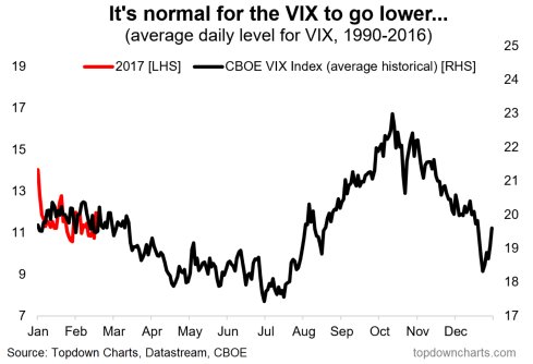
9. VIX seasonality: This curious chart – not to be taken literally – shows that the historical seasonal pattern has been to see a lower VIX on average in the April through July period, only to see it surge in the second half. So it raises the question – will the seasons continue to favor a lower VIX? There is precedent – go google “the great moderation” … a narrative that proclaimedlower volatilityof the business cycle (that theory suffered a big setback in the form of the global financial crisis, but before then we saw almost 5 years of low volatility.
Bottom line: Seasonality says the VIX could head lower (not yet, but from around Q2).
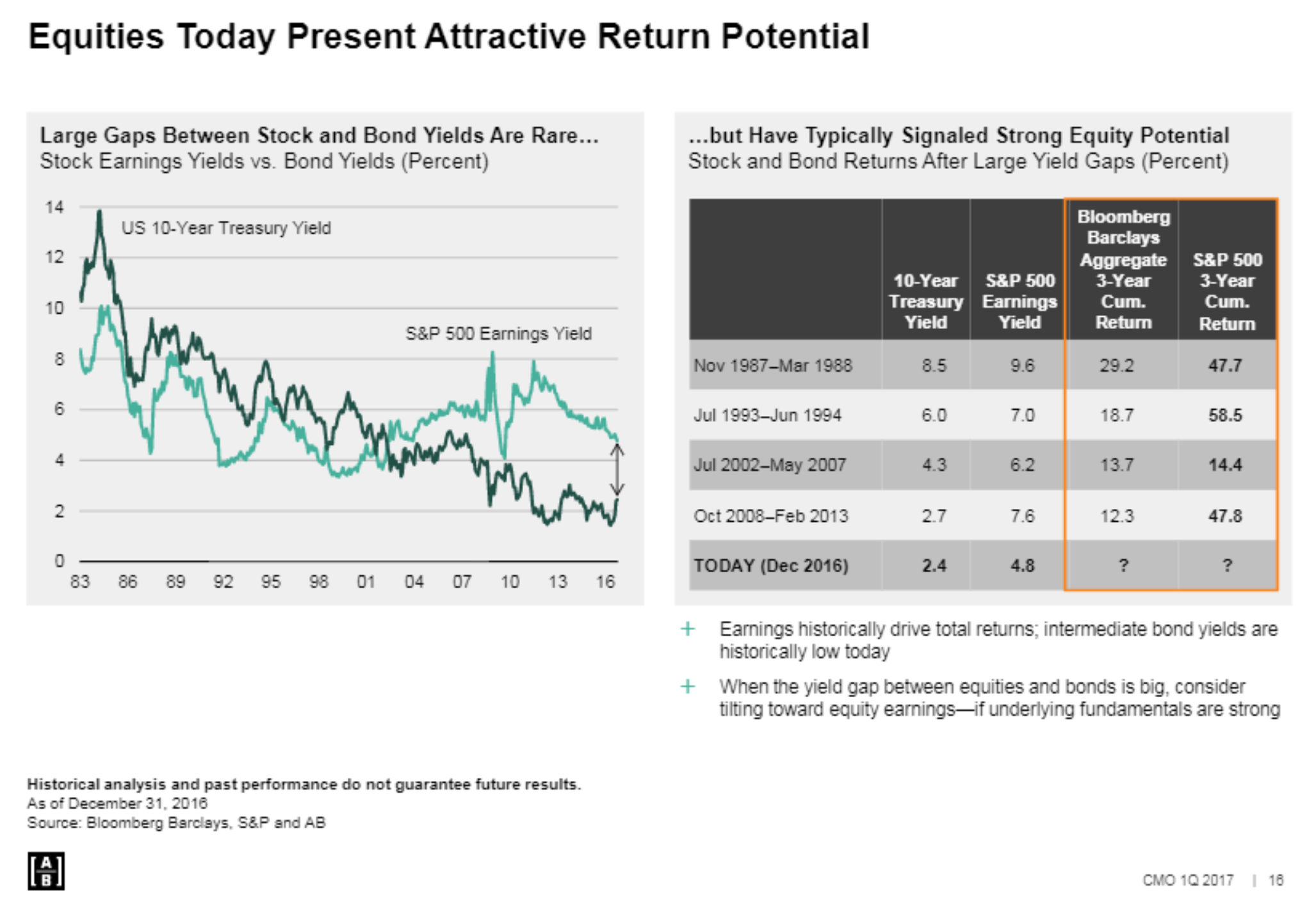
10. The earnings yield gap: The below analysis fromABshows how valuable to the outlook for the equity market a positive yield gap can be. While this gap has narrowed somewhat recently with the yield spike and surge in equities, it remains supportive.
Bottom line: The positive yield gap remains a source of return fuel for the market.
So where does all this leave us?
This week it’s basically all about sentiment and volatility.
1. Sentiment
We looked at rising euphoria, increasing stocktwits bullish sentiment readings (but with still material amounts of bearishness), and then mused upon the flow dynamics, noting the first net inflow in 12 months and how flows can become self-reinforcing.
2. Volatility
On the volatility aspect it was all about the 1% – the mysteriously absent 1%. 51 days since a 1% move and 89 days since a 1% fall, the rolling 12 month sum of 1% moves, and intriguing dynamics in cross asset volatility. We also noted how there is a seasonal tendency for volatility to remain low and head lower into Q2.
Summary
The combination of charts in this week’s edition highlights the conundrum of the current market regime. There is increasingly bullish sentiment and a tentative upturn in flows which could become a self-reinforcing dynamic to send the market higher. At the same time the slump in volatility tends to create a sense of unease… a sense that things seem just a little bit too quiet. But then we are reminded of seasonal tendencies and the 5 year patch of low volatility in the final stages of the Great Moderation. Problem is, this is all internally consistent, so it ends up being a conclusion of no conclusion. But with each step higher in euphoria, and each day further of low volatility, the sands in the hourglass grow ever smaller.
See also:Weekly S&P500 #ChartStorm – 12 Feb 2017
Follow us on:
LinkedInhttps://www.linkedin.com/company/topdown-charts
Twitterhttp://www.twitter.com/topdowncharts
Visit Website