“Volatility fires almost always begin in the debt markets…
Volatility is the brother of credit… and volatility regime shifts are driven by the credit cycle.”
“When times are good and credit is easy, a company can rely on the extension of cheap debt to support its operations.
Cheap credit makes the value of equity less volatile, hence a tightening of credit conditions (rising interest rates) will lead to higher equity volatility.”
“The IMF warns that 22% of U.S. corporations are at risk of default if interest rates rise.
Median net debt across S&P 500 firms is close to a historic high at over 1.5x earnings, and interest coverage rations have fallen sharply.”
– Christopher Cole, CFA, Artemis Capital Management, LP
Volatility and the Alchemy of Risk

At which point do rising interest rates spark the fire? Rates are key to the equation of risk. In today’s On My Radar, let’s take a look at what the current equity market valuations tell us about risk… and likely forward returns. Should you be playing more offense than defense or more defense than offense? Valuations can help.
Last November, I wrote:
Yes, the current trend evidence remains bullish, you’ll see valuation data below that tells us the coming 7-, 10- and 12-year equity market returns are not so good. Your and my clients are expecting 10% forward returns; however, due to extremely high valuations they are likely get 0% to 2%. Trouble spots? There are many. It is the bubble in the bond market that has me most concerned.
Yet, trend evidence continues to point positive for equities. My favorite weight of evidence indicator is The Ned Davis Research CMG U.S. Large Cap Long/Flat indicator. It looks at the momentum and overall market breadth across 22 sub-industries. When the majority of industries are in positive up trends, equity markets do best. When just a few stocks carry the market indices higher and the majority are breaking down, equity markets fair worse. The NDR CMG Long/Flat signal is bullish.
GMO has put out a 7-year Real Asset Return Forecast for many years. It 1999, they forecasted -1.5% returns. Today, you’ll see in a chart below, GMO is forecasting -4.1% annualized over the coming 7-years (it’s since moved lower as you’ll see below… current forecast is -4.7%). Yes… minus. Imagine your $1,000,000 in Large Cap stocks worth $750,000 in the year 2024. That’s the forecast. Many thought they were nuts in 1999. They were right. You and I may think they are nuts today. What if we are wrong? GMO’s valuation process is sound.
We’ll also take a look at other important measures that can guide us and help set reasonable expectations – Median P/E, Price-to-Sales, Price-to-Book and one of my favorite measures that is based on how much you and I (individual households) have invested in equities. The correlation to future outcome is nearly 1. In non-geek terms, “yikes!”
You’ll also see in the charts I share with you that the 10-year and 12-year numbers are not as dire as GMO’s forecast but they are not going to warm your heart. My two cents: stay alert and risk-minded. Seek growth but do so in a way that preserves your principal from the severe losses bear markets bring.
Grab a coffee and find your favorite chair, click through and read on. We’ll get the “all clear” signal at some point in the next few years.
Included in this week’s On My Radar:
- Stock Market — Valuations and Forward 7-, 10- and 12-Year Returns
- The Lion in the Grass We Don’t See
- Trade Signals — Investor Sentiment Positive; Fixed Income Sell Signals; Equity Trend Signals Remain Bullish
- Personal Note
Stock Market — Valuations and Forward 7-, 10- and 12-Year Returns
It has been several months since I last updated you on valuations. A number of charts follow but you should be able to read through this section quickly. I try my best to hit the high points and summarize “bottom line” what each means.
Chart 1:
- Note the yellow dot vs. the 1929 and 2007 market peaks.
- The orange line marks the Tech bubble period.
- We are 3/10ths of a percent from the 1929 valuation high.

Source: dshort.com
My favorite valuation chart is median P/E. I like it because by looking at the median P/E (the P/E is the middle out of all the stocks in the S&P 500 Index), it tends to eliminate one-time accounting items, etc. I also like it because we can then compare where we are valuation-wise vs. where we have been historically and get a good sense of what the forward 10-year returns might be.
Chart 2: S&P 500 Index Median P/E
- Note the “We are Here” annotation (red arrow and red box).
- Note the few times since 1964 where the market was this much overvalued.
- Take a look at the orange arrow and the yellow highlighted oval.
- It shows just how far the market is priced above “median fair value” and the amount of decline it would take to get to that level.
- Needed is a 36.4% correction just to get back to fair value.
- I also like how the data process considers levels of both “Overvalued” and “Undervalued.”
- I like to think of them as risk and return targets.
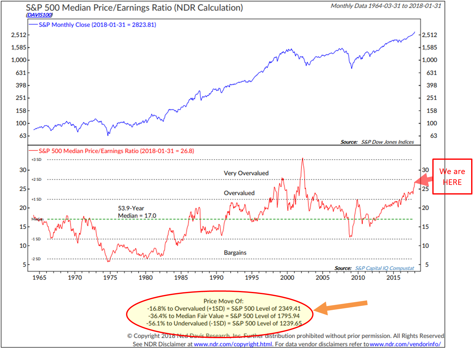
Source: Ned Davis Research
Bottom line: The market is severely overvalued. If we get a 36.4% correction to median fair value, overweight stocks again. If we get a 56.1% correction, then go all in (of course, please note this is not a recommendation for you to buy or sell any security… speak with your advisor). Until then, follow trend evidence to help you risk-manage your exposures.
I want to note that valuations are a poor market timing indicator. What is overvalued today can grow to be even more overvalued and that has been the case over the last few years. But valuations are a great long-term predictor of the annualized returns you are likely to get. Let’s look at that in this next chart.
Chart 3: What Median P/E Tells Us about Forward 10-year Returns
When valuations are high, forward returns are low. We have no idea as to the next one to two years, but we have a really good idea about the coming 10 years.
Here is a look at the data (1926 to December 31, 2014) and how to read it:
- Returns are ranked by quintile. 1 is lowest incidences of median P/E, 5 are the highest incidences. Reported is the nominal (before factoring inflation) subsequent 10-year realized median returns by quintile.
- They took each month-end median P/E and looked at the annualized return that occurred in the S&P 500 Index 10 years later.
- Then they sorted the results into five quintiles and posted the median annualized return by quintile.
- We currently sit in Quintile 5 today.
You can read more in a white paper I wrote called, “The Total Portfolio Solution.”
Chart 4: Shiller P/E Currently 31.46 (11-10-2017)
- Data is from 1880 to present.
- Note higher than 1929’s “Black Tuesday” and 1987’s “Black Monday.”
- Note higher than any other time with the exception of the 2000 Tech bubble.
Source: http://www.multpl.com/shiller-pe/
Chart 5: What Shiller P/E can tell us about coming 10-year real (inflation adjusted) total returns
Here’s how to read the chart:
- We sit high in the highest 20% of all monthly valuation numbers since 1880.
- The chart details the returns that occurred 10 years after each month-end Shiller P/E reading. It then groups the numbers into five quintiles ranging from lowest P/Es to highest P/Es and shows the average annualized return after inflation based on each quintile.
- Note the average P/E for each quintile is shown at the bottom of each blue bar.
- Bottom line: you get much more return on your money when you buy low (valuations are most attractive) and least when you buy high (like today). Expect 2.3% real annualized returns over the coming 10 years (and likely a bumpy road on the way to those low returns).
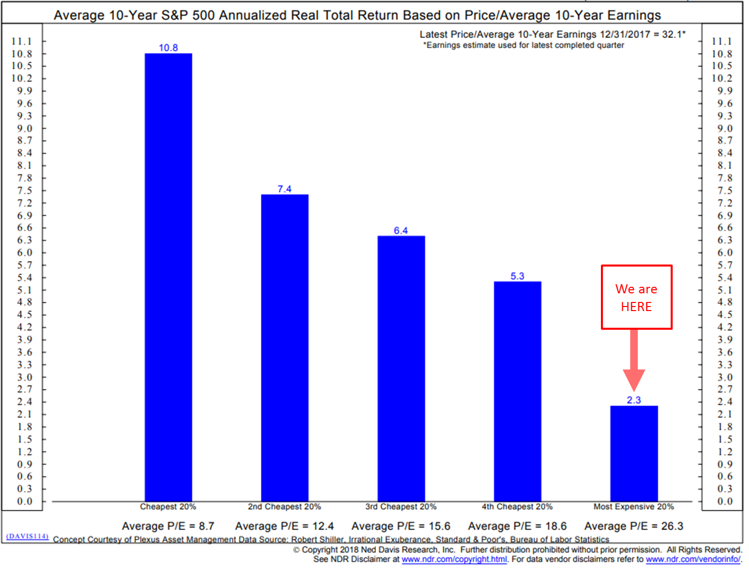
Chart 6: Stocks as a Percentage of Household Equity vs. Subsequent Rolling S&P 500 Index Total Returns
Here’s how to read the chart:
- Blue line tracks the percentage of household financial assets that are allocated to equities. The dotted black line is important. It tracks/plots the returns that were actually achieved 10 years later.
- The logic is that when investors are heavily weighted into stocks, there is less buying power left in their tanks. Investors are mostly all in. Less available fuel to buy and propel prices higher.
- Red boxes and lines mark certain dates when ownership was high and point to the returns that were forecast by the percentage of ownership. For example, note 2000 and the forecast return of -3% per year for 10 years. Then take a look at the dotted black line. The actual return since 1999 came in at about that number. The actual return from 2000 to 2009 came in slightly better at -2%.
- Take a look at the green boxes and lines. Same concept but in reverse. Low equity percentage ownership means that there is more money available to buy stocks. And the subsequent returns tell the story.
- Simply, periods of high stock ownership correlate with lower subsequent returns and low stock ownership correlates with higher subsequent returns.
- As Sir John Templeton said, “The secret to my success is I buy when everyone else is selling and I sell when everyone else is buying.” This chart is a demonstration of Sir John’s axiom.
- Finally, note how closely the dotted black line (the plotting of the actual return over a rolling 10-year period) closely tracks the blue line (percentage of stock ownership)…
- with a 0.91 correlation coefficient since 1951.
- In geek language, that’s a statistically significant correlation not to be ignored.
- This chart says we should expect 1.00% annualized returns over the coming 10 years… before inflation. Not so good. B. I expect it to be updated through December 31, 2017 soon. I imagine ownership has gone up even more with the tax cut excitement and year-end rally.
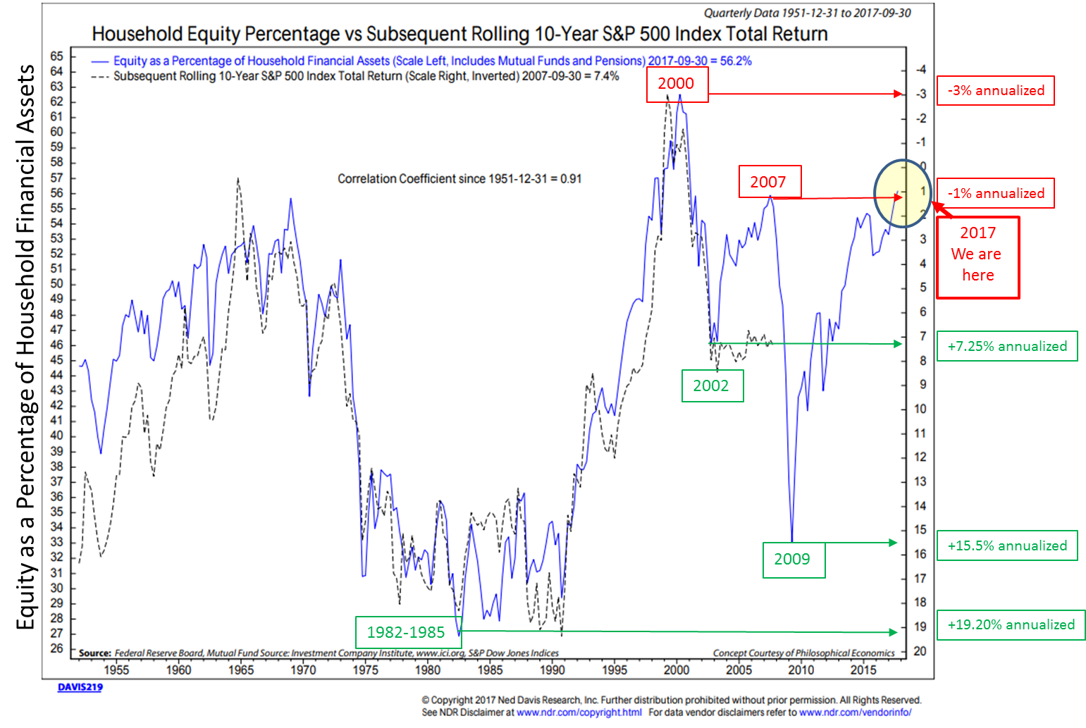
Chart 7: GMO’s 7-Year Real Return Forecast
- I added the red arrows for emphasis.
- Forecasting -4.7% for equities and -1.0% for U.S. bonds over the coming seven years.
- I have followed GMO’s monthly forecast updates for years. I have never seen it this low… and certainly not when bonds offered negative returns.
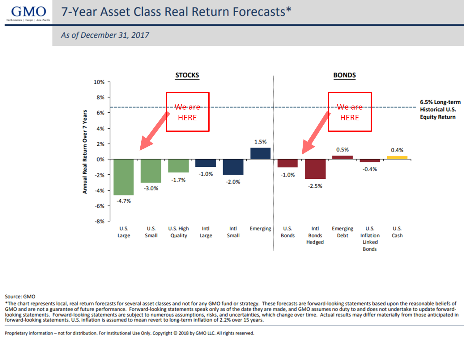
Source: GMO
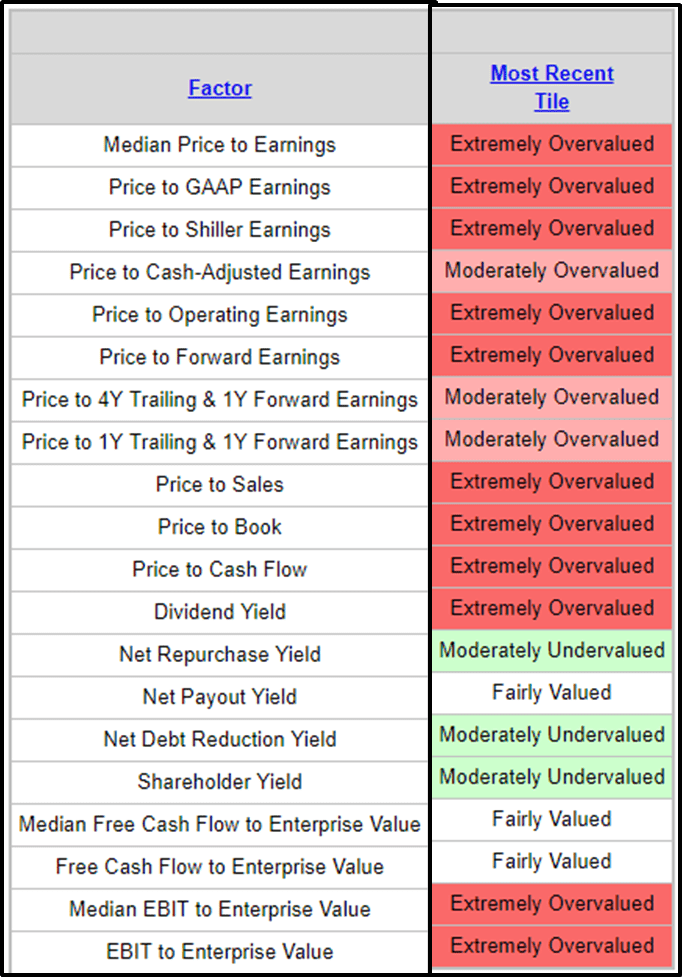
Chart 8: Other Valuation Measures
- Simple conclusion, most metrics are “Extremely Overvalued.”
Warren Buffett has a saying about hamburgers. He thinks investors should think about stocks like they think about hamburgers. When hamburgers are low in price, you get more for your money. When they are high in price, you get less. Same with the stock market.
Chart 9: The Buffett Indicator — Corporate Equities to GDP
This indicator takes the value of corporate equities from the Fed’s Quarterly Z.1 Balance Sheet and compares it to U.S. Gross Domestic Product.
- Think of the U.S. as one big business and it produces a number. In this case, GDP is used.
- If your business produced $1 million and the value of all your outstanding shares times your current stock price was $2.38 million, the value of your business would be worth 138% more than what you produced.
- Think of it just as a base line measure.
- You can then compare that base line measure to points in time (history) and see just how richly priced you are relative to history.
- If I’m going to buy your stock, am I paying a lot or getting a good deal? Of course, that depends on your ability to grow your sales; I can estimate that…but I want to see how much I’m paying for your shares relative to your business growth over time.
- So think of all the stocks in the U.S. compared to where they have been historically. Since 1990, GDP has averaged around 3%. I suspect over time, as it has in the past, it will fluctuate between 2% and 4% with a few select periods above and below those numbers. See chart on GDP since 1990 here.
Bottom line: The “Buffett Indicator” is at the second highest level since 1950. We are not getting a lot for our money (i.e., investment). Also note the opportunities that presented in 2002 and 2008.
Source: Advisor Perspectives; dshort.com
Chart 10: Hussman 12-Year Forward Returns
From John Hussman’s February 2018 post:
Here is how you read the chart:
Last week, the U.S. equity market climbed to the steepest valuation level in history, based on the valuation measures most highly correlated with actual subsequent S&P 500 10-12 year total returns, across a century of market cycles. These measures include the S&P 500 price/revenue ratio, the Margin-Adjusted CAPE (our more reliable variant of Robert Shiller’s cyclically-adjusted P/E), and MarketCap/GVA – the ratio of nonfinancial market capitalization to corporate gross value-added, including estimated foreign revenues – which is easily the most reliable valuation measure we’ve ever created or tested, among scores of alternatives.
A few charts will bring the valuation picture up-to-date. The first chart below shows the ratio of MarketCap/GVA, which now stands beyond even the 2000 market extreme.
Take MarketCap/GVA, put it on an inverted log scale (left) and you get the blue line below. The red line (right scale) is the average annual nominal total return of the S&P 500 over the subsequent 12-year period. The correlation between the two is 93%. From present levels of valuation, we fully expect the S&P 500 to lose value, on a total return basis, over the coming 12-year horizon. That’s not a worst-case scenario or an outcome that depends on unusual economic outcomes. It’s actually the standard, run-of-the-mill expectation given current valuation extremes, and it assumes substantial expansion in the U.S. economy over this horizon.
The next chart shows our Margin-Adjusted CAPE, in data since the 1920’s, which is also easily at the most extreme level in history. Notably, the relationship between the Margin-Adjusted CAPE and actual subsequent market returns is more reliable than for the raw Shiller CAPE.
One last point from Hussman…
On interest rates and corporate taxes
This brings us to the question of interest rates. Don’t low interest rates justify rich valuations? Not so fast. Remember how discounted cash flows work. If interest rates are low because growth rates are also low, no valuation premium is “justified” by the low interest rates at all.
Despite some investors waxing rhapsodic about things like “mass collaboration and sharing enabled by technology and global communications networks,” S&P 500 Index revenues have grown at a nominal rate of just 3.2% annually over the past 20 years, and just 1.6% annually over the past decade, and that includes the benefit of stock buybacks. Even the steep expansion of profit margins over the past 20 years (investors forget that one of the reasons P/E ratios were high in the late-1990’s was because margins were actually below-average) has produced average S&P 500 earnings growth of just 5.0% annually, and only 3.1% annually over the past decade. While these growth rates are already below historical norms, further earnings growth at a rate higher than revenue growth would require profit margins to advance without limit.
You can read his full piece here.
Chart 11: Regression to Trend. Another Look at Long-Term Market Performance
Just keep these next charts in the back of your mind. About the only certainty in the stock market is that, over the long haul, over-performance turns into under-performance and vice versa.
Source: Advisor Perspectives; dshort.com
Here is a closer look at the bottom section:
Source: Advisor Perspectives; dshort.com (Source).
The peak in 2000 marked an unprecedented 137% overshooting of the trend — substantially above the overshoot in 1929. The index had been above trend for two decades, with one exception: it dipped about 15% below trend briefly in March of 2009. At the beginning of January 2018, it is 123% above trend, exceeding the 68% to 90% range it hovered in for 37 months. In sharp contrast, the major troughs of the past saw declines in excess of 50% below the trend. If the current S&P 500 were sitting squarely on the regression, it would be at the 1,249 level.
Points of “secular” undervaluation such as 1922, 1932, 1949, 1974 and 1982 typically occurred about 50% below historical mean valuations, and were associated with subsequent 10-year nominal total returns approaching 20% annually. By contrast, valuations similar to 1929, 1965 and 2000 were followed by weak or negative total returns over the following decade. That’s the range where we find ourselves today.
QUICK MATH UPDATE:
In the intro today, I said, “GMO has put out a 7-year Real Asset Return Forecast for many years. It 1999, they forecasted -1.5% returns. Today, you’ll see in a chart below, GMO is forecasting -4.1% annualized over the coming seven years (it’s since moved lower as you’ll see below… current forecast is -4.7%). Yes… minus. Imagine your $1,000,000 in Large Cap stocks worth $750,000 in the year 2024. That’s the forecast. Many thought they were nuts in 1999. They were right. You and I may think they are nuts today. What if we are wrong? GMO’s valuation process is sound.”
Let’s update the math on that $1 million starting point since the S&P 500 Index has gained 6.29% since that post:
Update: When I wrote the above on November 10, 2017, the S&P 500 Index closed that day at 2,582.30. It’s at 2,744.29 at the time of this writing for a gain of 6.29%. If we calculate that gain into the $1,000,000 hypothetical starting point on November 10, 2017, your new value is $1,062,854. If we then compound that new starting position at -4.70% per year for the next seven years, your money declines to $758,794.05 (yellow highlights). That’s tough math for the pre-retiree or retiree who needed their money to work for them.
- Reflects 6.29% gain since November 10, 2017, no additional gain from here, followed by GMO’s -4.70% annual seven-year forecast of -4.70% per year:
Maybe we go up 20% from here, but it will likely cause the GMO seven-year forward real return estimate to go further into the negative. Next chart reflects the 6.29% gain since November 10, 2017, an additional 20% gain, followed by my personal guesstimate of a -6% annual loss forecast for seven years.
What if we go up 40% over the next year and I assume a -8% seven-year forward return? Your current $1,062,854 declines to $830,073 on February 16, 2025. Good start, bad ending.
Finally, I assume a 40% gain over the coming year followed by the current -4.70% GMO seven-year forward return forecast (though I’m sure that number will change for the worse if we move up 40% from here). Pretty much a not-very-tasty-nothing-burger by February 16, 2025.
The point I’m trying to make is, over long periods of time, valuations matter. I often get an email or two saying, “Steve, you are so bearish.” I’m really not. If I was stuck in a buy-and-hold mindset, yes, I’d read the tea leaves as bearish and be depressed. We are where we are… I believe we will see a generational buying opportunity in the coming few years. Let’s not get run over on the way to that opportunity.
Game plan: Seek growth opportunities while maintaining a level of protection in down markets. Find an advisor who can help you put together a sound game plan that best suits your retirement income needs, risk level and time horizon.
The Lion in the Grass We Don’t See
We are eight years into the equity bull market and I personally believe there is more run left in the run. Yet front of mind is that recessions have occurred one or two times each decade since 1850 (last was the great recession in 2008-09) and the record debt load and today’s initial starting conditions (high valuations and very low interest rates) make it more challenging. I have my doubts the current decade escapes recession.
I also wrote last September, “The biggest bubble of them all is in the bond market. Global debt is out of hand. Rates are negative in much of the world. I believe that inflation will be higher a year or so from now, the central bankers will raise rates and that move will kill the economy and drive us into recession. We go higher then lower and may ultimately take out the 1.37% yield low made in July 2016. We’ll see.”
Inflation is beginning to pick its head up. Will it stick? We don’t yet know… but in the last six weeks, the yield on the 10-year Treasury has jumped from 2.40% to 2.90%. Signs of inflation are leading people to believe that the Fed will raise rates four times this year.
A friend sent me the following paper just after the recent volatility melt-down (see last week’s On My Radar). I shared with John Mauldin and in a recent conversation, we spoke about a paper he wrote years ago discussing risks… he said it is the “lion in the grass we don’t see that we need to worry about.”
I believe the over concentration into the same passive index exposure, the risk parity trade and all of the people that were shorting volatility are lions we don’t see. Except Chris Cole, CFA of Artemis Capital Management, did see it and wrote about it last October in a piece called, “Volatility and the Alchemy of Risk.”
When you have some extra down time, I recommend you read the paper. There is so much more going on that we all need to be aware of and this paper will help you see what might be hiding in the grass.
You can find the paper here.
Trade Signals — Investor Sentiment Positive; Fixed Income Sell Signals; Equity Trend Signals Remain Bullish
S&P 500 Index — 2,677 (02-14-2018)
Notable this week:
Most notable this week is that investor sentiment is no longer excessively optimistic. In fact, the daily sentiment charts are showing extreme pessimism for the first time in a long time, which is short-term bullish for equities. Our fixed income signals are bearish. The Zweig Bond Model (a trend model for the bond market) is in a bearish “sell” signal. HY is also in a “sell” signal. As for equities, the bullish trend persists as measured by the NDR CMG U.S. Large Cap Long/Flat Index (indicator) and the 13- vs. 34-week MA of the S&P 500 Index (charts below). Volume demand (buyers) is higher than volume supply (sellers), which is bullish for equities, but the trend is weakening and bears watching. Don’t Fight the Tape or the Fed is signaling a moderately bearish -1 reading (see information below). Real concern will be signaled should the indicator move to -2. The long-term trend in gold remains bullish.
Long-time readers know that I am a big fan of Ned Davis Research. I’ve been a client for years and value their service. If you’re interested in learning more about NDR, please call John P. Kornack Jr., Institutional Sales Manager, at 617-279-4876. John’s email address is [email protected]. I am not compensated in any way by NDR. I’m just a fan of their work.
Click HERE for the latest Trade Signals.
Important note: Not a recommendation for you to buy or sell any security. For information purposes only. Please talk with your advisor about needs, goals, time horizon and risk tolerances.
Personal Note
I was in NYC on Monday and sat in on my fishing friend, David Kotok’s, lunch time presentation. David founded and leads the annual Camp Kotok “shadow Fed” fishing event. I’ll be attending again this August. David runs the investment management firm Cumberland Advisors. Sharp, smart and well-informed.
We talked yesterday. I had questions around the Fed and specifically a question about one of his charts that showed the Fed’s balance sheet and how, as the holdings roll off, the amount of dollar currency in circulation continues to increase. David dove in and I took notes. At the end of the call, I thanked him for taking me to school though I wished I recorded our conversation. I told David I took in about 30% of what he was teaching me. I imagined what my wife, Susan, must feel like when I go all-out economic geek in conversation with her. I did my best to keep up with David.
What I can say is that I believe he is in the “beautiful deleveraging” camp. A term Ray Dalio coined citing one of two potential outcomes: a beautiful or an ugly deleveraging. David said, “The Fed is completely in control of price and inflation.” He explained the new tools implemented post the great financial crisis. Yet he added the path forward is not without risks and one of the biggies on the risk list is an inflation shock coming from something like “oil” or what I believe is coming in agriculture prices.
David also believes there are two additional risks: one is an unforeseen derivative-related counter-party blowup and another may be a change in Fed governance (many seats are up to be filled under President Trump), which leads to a change in Fed game plan. I assumed he was saying the Fed would abandon the current mechanisms that enable them to … completely control price and inflation. He concluded that we’ll continue my education at Camp Kotok in August. To which I can’t wait.
I’m left wondering about the lion in the grass we don’t see. I wish valuation levels offered us more return and less risk. That day will present again.
Snow is in the forecast for Saturday and the good news is my new snow blower arrives today. I hope I can figure out how to get it started. Back-up shovels are in the garage and our army of boys will be home. Next Tuesday it’s supposed to be 72 degrees. I’m hoping for not much snow and a late afternoon walking a few holes on the golf course next week.
A quick trip to Dallas on Monday. I’ve been asked to present at the Mauldin Economics Strategic Investment Conference in March and I’m pretty excited about that. If you are coming, please track me down and let’s grab a coffee or beer. Here is information on the 2018 SIC:
San Diego on March 6-9. You can learn more and find the agenda information here. Send an email to Shannon Staton ([email protected]) for conference info and I’ve asked her if she can provide you with a registration discount.
Enjoy your weekend. Treat yourself to something fun. And given recent unimaginable events… hug your family and hold them tight.
Have a great weekend.
With kind regards,
Steve
Stephen B. Blumenthal
Executive Chairman & CIO
CMG Capital Management Group, Inc.